Little Me Therapies Website & Branding Design
Client
Project Type
Project Year
Tools
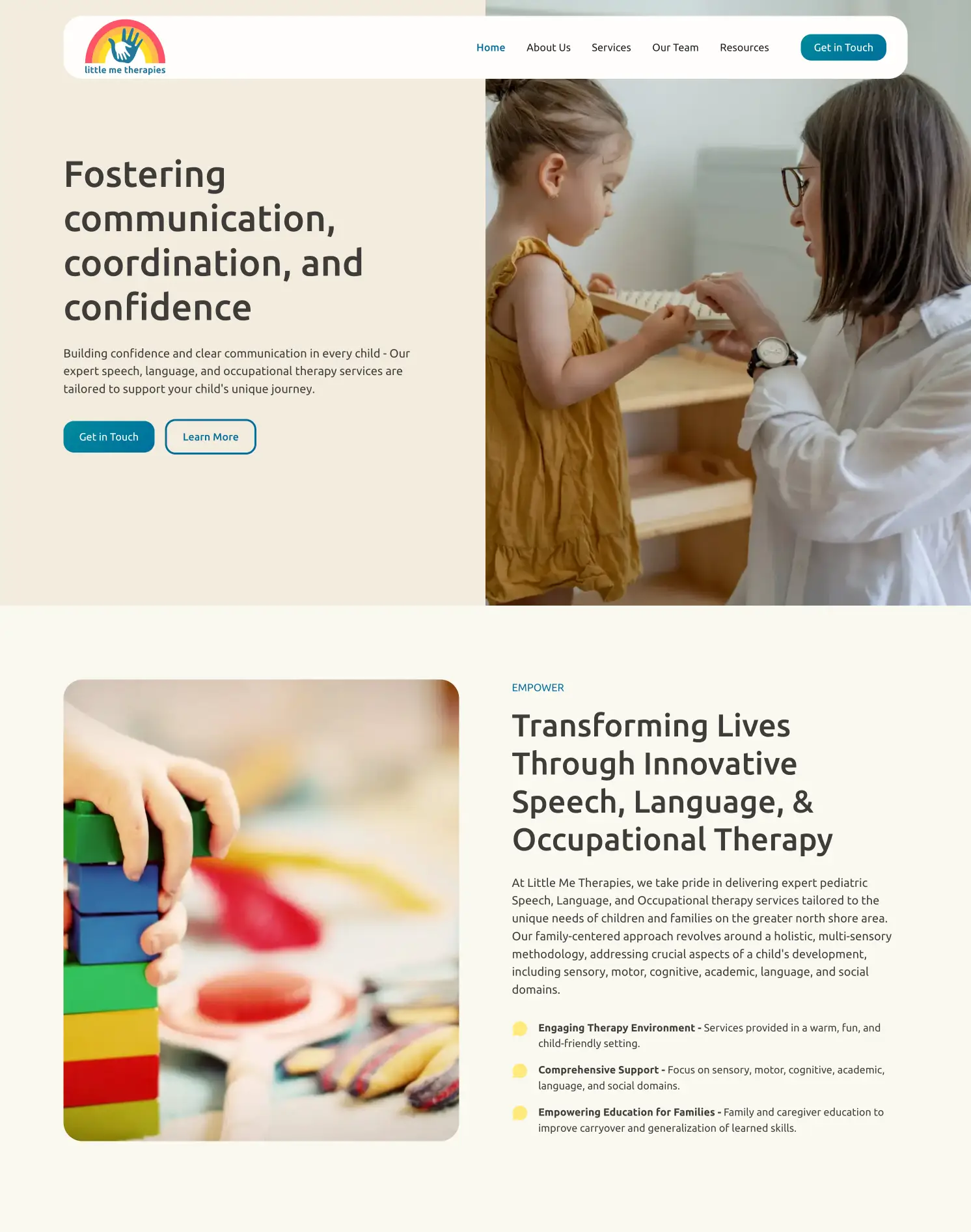
Little Me Therapies is a pediatric speech, language, and occupational therapy service utilizing a holistic approach for the individual needs of the child and the family. My role was to revamp their branding, and design and build a new website to differentiate the practice and better showcase their services and expanded team.
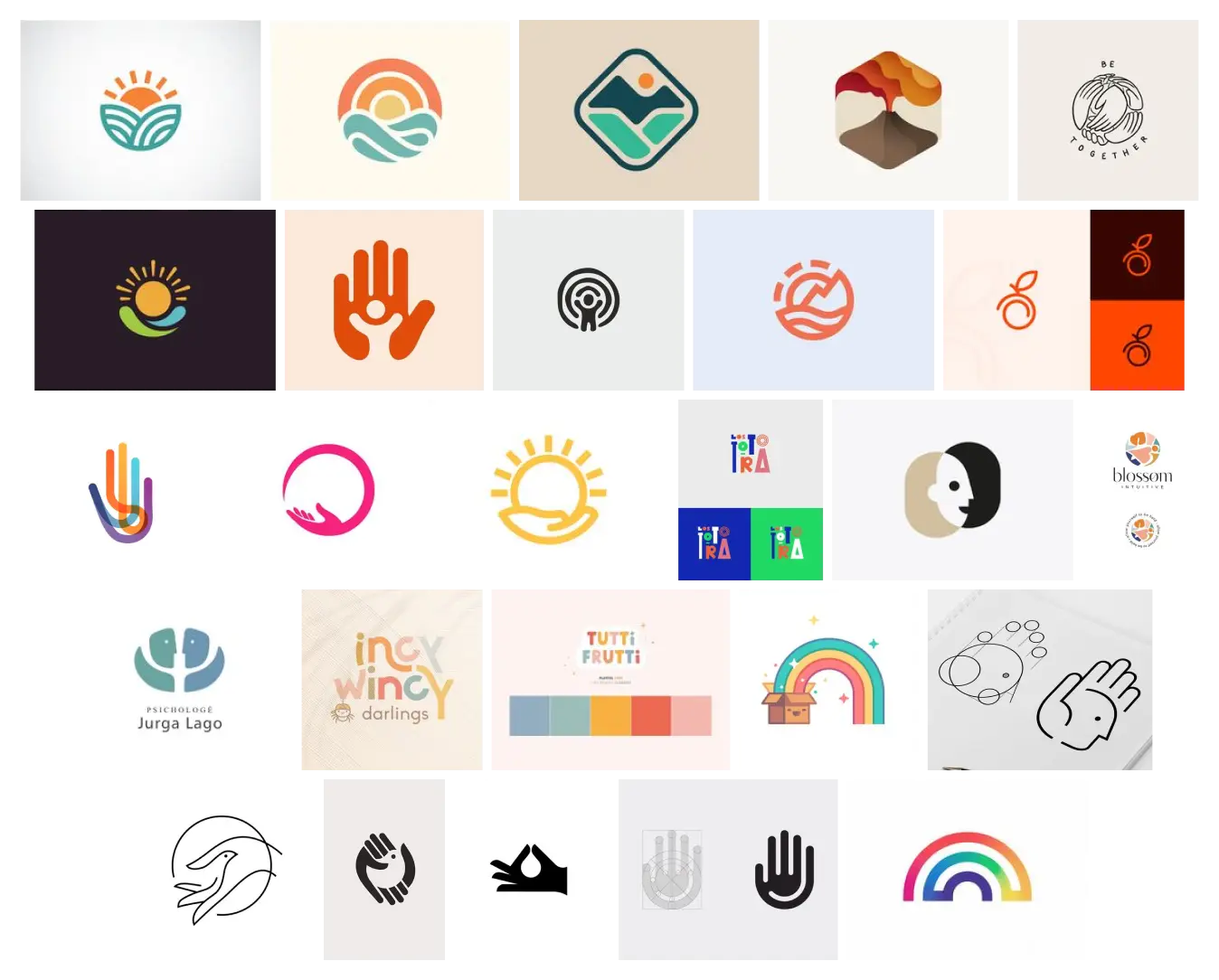
In the initial phase, I delved into competitive research to explore various logo and branding designs. My focus was on identifying elements that resonate with the brand's essence and values.
In the initial logo sketches, I used Procreate to bring to life the emotions outlined by the client. Collaborating closely, we shaped the design to align with the brand's vision and added personal elements. The focus was on achieving a balance between aesthetics and emotional impact for a compelling visual representation.
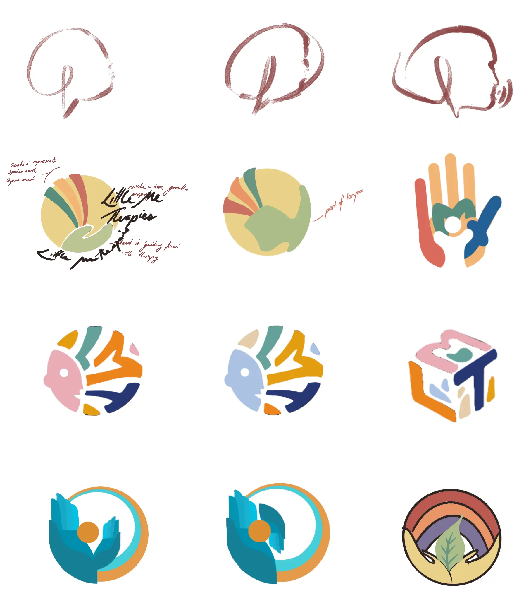
Throughout the design process, I translated Procreate sketches into high-fidelity logo concepts using Curve. This involved a close collaboration with the client, presenting alternatives that incorporated key elements from the daughter's original design. The aim was to craft concepts that not only maintained creativity but also visually represented the brand's core values, conveying trust, warmth, and connection.
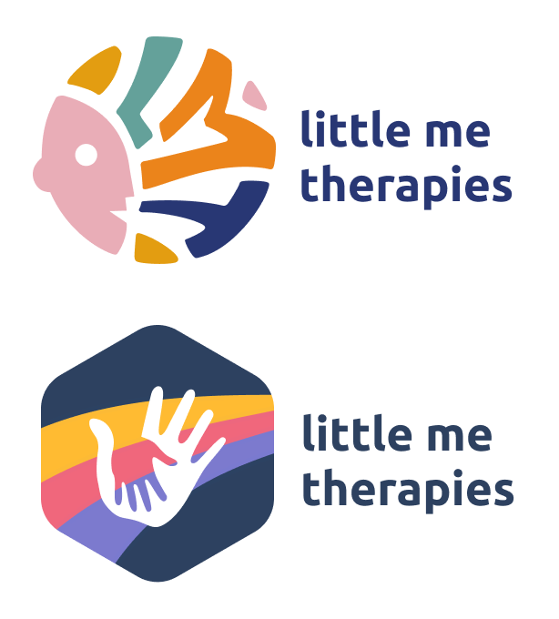
In the final decision-making phase, the client chose to retain the daughter's original design, driven by its sentimental value, a choice that was fully respected.
To ensure transparency and comprehensive communication, I highlighted potential implications of the original logo on the color scheme, design, accessibility, and overall user experience of the website. This included addressing challenges such as limited contrast and intense colors that might impact readability and user comfort.
To optimize accessibility, modified versions of the logo were presented, aiming to address these challenges while preserving the essence and sentimental value of the original design.
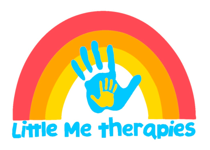
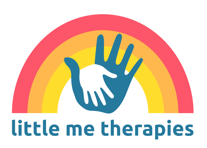
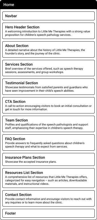
Originally, the plan was to create separate pages for each section. However, as the project progressed, I opted for a more user-centric approach by consolidating the pages into a single, streamlined layout. This decision, made in collaboration with my client, aimed to eliminate redundancy and enhance overall navigation. Shifting from a multi-page to a single-page design ensures a more efficient and accessible user experience, aligning with the content's focused presentation.

I used subtle interactions and maintained a minimalist approach to the design of the website with a clean and uncluttered aesthetic. Choosing assets and styles for impact with intentional use of whitespace throughout the design to enhance readability and draw attention to key elements.
In redefining Little Me Therapies visual identity, I selected bright and calming imagery that resonates with the target audience—parents seeking speech therapy for their children. These carefully chosen visuals showcase a warm, inviting, and nurturing atmosphere, reflecting the practice's dedication to fostering communication and confidence children.
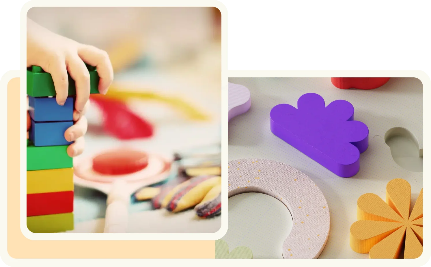
Ensuring a unified look, I maintained brand consistency by incorporating colors from the logo throughout various site elements, reinforcing the distinctive identity of Little Me Therapies.
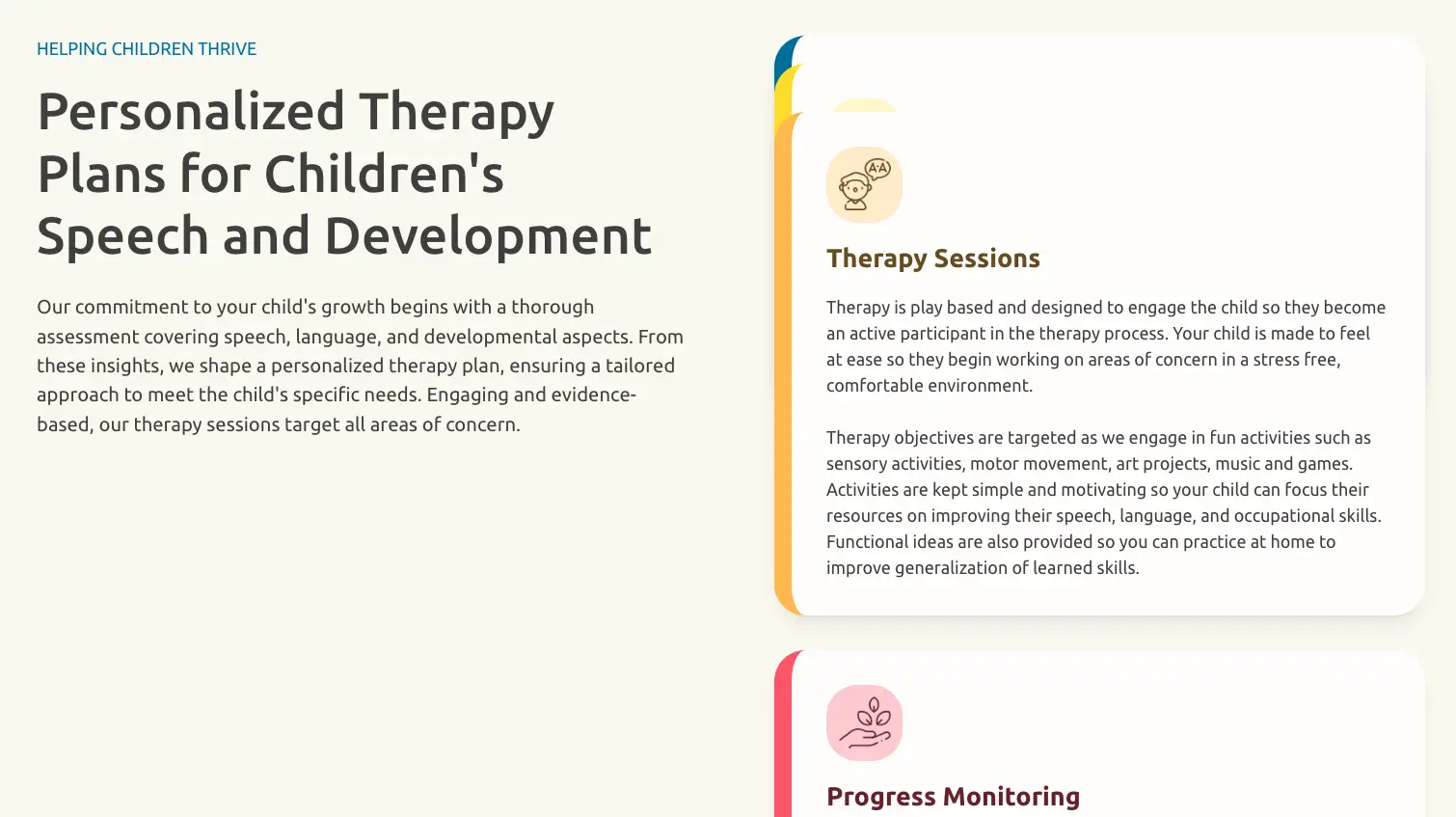
The Services Section demonstrates thoughtful design, with each step in the process—'Assessment,' 'Therapy Plan,' and more—represented by a corresponding color from the logo. This intentional organization, coupled with engaging icons for each service card, creates a cohesive and visually compelling experience for visitors as they explore the site.
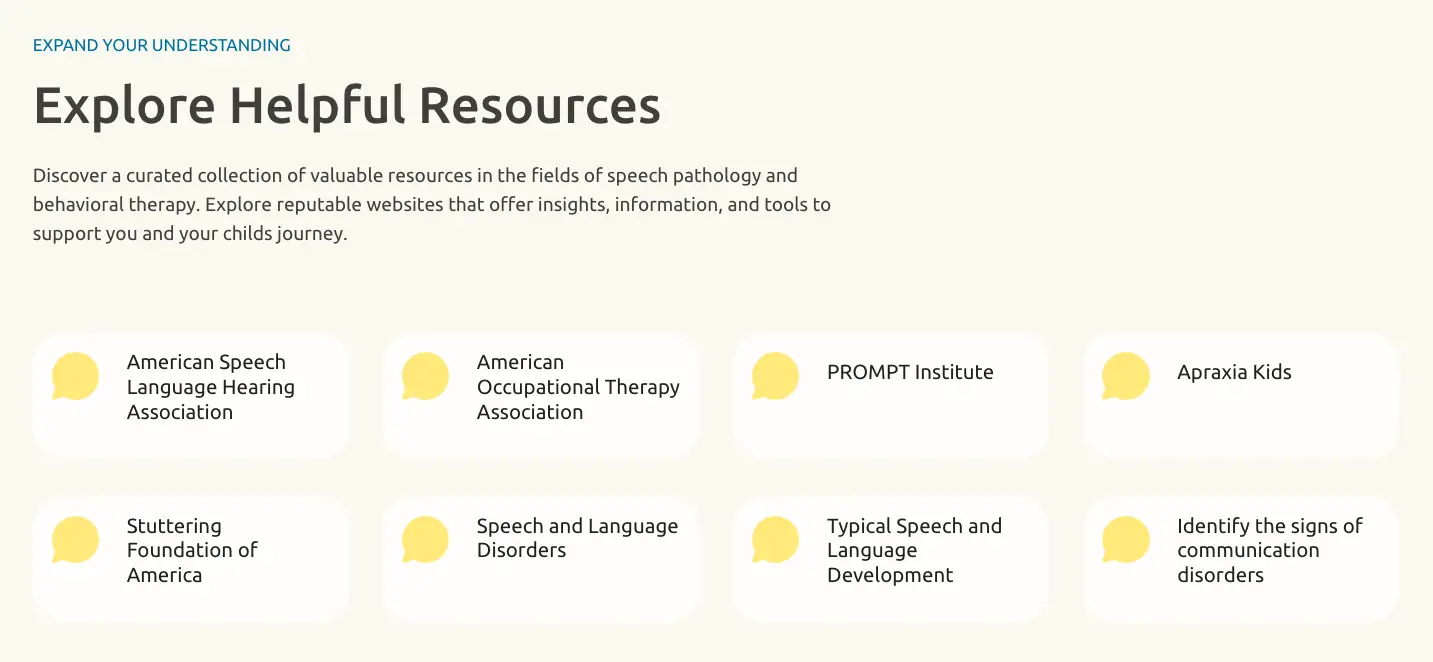
The inclusion of the resources section was driven by a commitment to providing caregivers with easily accessible information. This addition serves to distinguish Little Me Therapies from other therapist websites. The organization of the section, presented in a grid of card links, ensures a user-friendly and straightforward navigation experience, promoting efficiency in accessing valuable information.
The revamped Little Me Therapies website not only achieves enhanced aesthetics and functionality but also successfully showcases the expanded services and team, meeting the core business objectives.


Learnings
What did you learn?
I gained proficiency in optimizing my workflow through tools like Relume's sitemap generator and components, enhancing efficiency in project organization and management.
Utilizing Webflow for both design and development, I learned to seamlessly transition from site mapping to actual implementation, providing greater flexibility in adapting the design to the identified information hierarchy.
What was the most challenging thing about this project and how did you overcome it?
The most challenging aspect was ensuring a cohesive brand representation while accommodating the sentimental attachment to the original logo. I overcame this by transparently communicating potential implications of the original design, presenting alternative modifications to preserve both sentiment and design standards.
Did you enjoy a particular part of the design process?
I particularly enjoyed the iterative logo design process, collaborating closely with the client to infuse emotions into the brand. It was fulfilling to witness the transformation from initial sketches to a final design that resonated with both the client's vision and the brand's identity.

