Spectrum Website Redesign and Development

Client
Project Type
Project Year
Tools
Spectrum is a company developing a queer community app for people who are isolated, closeted, or at risk with the tools to manage their mental health, find resources and information and connect with the community.
My role was to redesign and rebuild their website in order to better reach their target markets and increase their app downloads.
At the outset of this redesign I researched into other app websites that uniquely showcase their apps for inspiration on how to best create solutions.
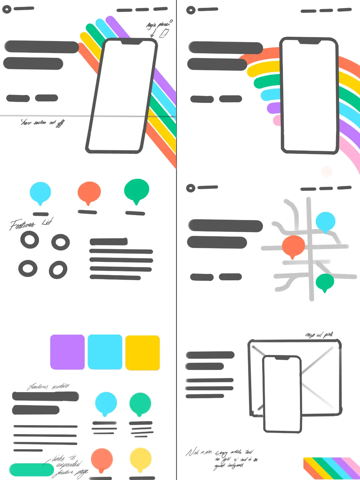
Using this as inspiration, I created sketches using Procreate to brainstorm ideas and iterate through many design options.

I created high fidelity wireframes using Figma to provide an accurate representation of the redesigned user interface.
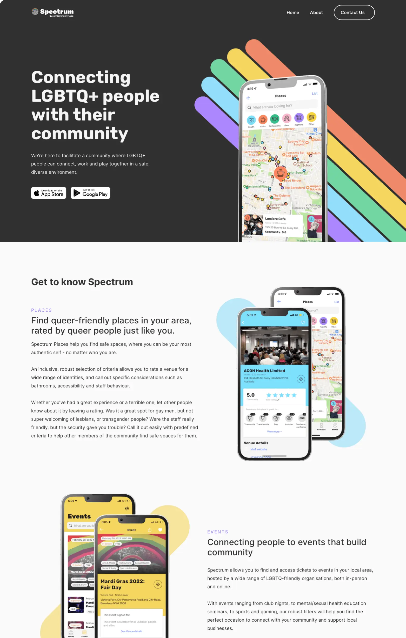
Drawing inspiration from the Spectrum logo and branding, I incorporated colors and curved visual imagery throughout the site, organically translating Spectrum’s branding into the web experience.


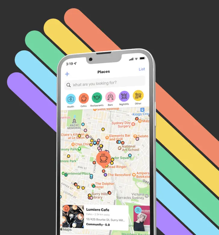
As your first encounter of a website, the hero section needs to make a statement. By playfully combining a rainbow motif with a phone showcasing Spectrum’s app, as if it were a hand gripping the device, you’re drawn in and compelled to explore.
This set the stage for the rest of the sites design, where I repeated this motif to add a sense of cohesiveness.

Following a design review and feedback from the Spectrum team, final alterations were made to the wireframes to improve the user-flow.
The ‘Download Spectrum Call to Action (CTA)’ was relocated to a more intuitive place after the Features section, and the ‘Pride Gin CTA’ was redesigned to be more eye-catching, allowing the gin bottle to flow over the sections boundaries.


Accessibility and responsiveness across devices were prioritized to increase ease of use throughout the site, the Pride Gin CTA being a prime example.
To maintain its visual impact on smaller screens while ensuring text legibility, I decreased the rainbow motif’s opacity and rotated the Pride Gin image.
Previous versions of this section showed the bottle at different 90° angles. I rotated it to increase spaciousness within the section and add a sense of novelty, reflecting the way the bottle isn’t bound by the sections edge in the desktop and tablet layouts.


After a final review, I built the site in Webflow, using more professional visual assets for the phone displays, then deployed it with Netlify.


Learnings
What did you learn?
I gained a better understanding of Figma, utilizing auto-layout and components to speed up the process of wireframing. My programming knowledge came in handy in structuring these components.
I learned how to organize the project and standardize processes across pages in Webflow by using the Finsweet Client-First framework. Enabling faster development within Webflow and increasing the ease of future website alterations.
What was the most challenging thing about this project and how did you overcome it?
Threading together the process of designing a website in Figma, building it in Webflow, then deploying it on Netlify was challenging. Many project aspects needed to be considered and kept in the forefront of my mind. To handle all this information, I updated my knowledge and project management workflows. Leveraging the organizational capabilities of Obsidian, a markdown based, note taking app.
Testimonial
Wanted to give a massive shoutout to the divine Chris Barfod who designed our shiny new website for Spectrum!
He's been an absolute joy to work with and we are SO beyond happy with the end result. This new site tells our story in a much better way than we were doing previously and it looks absolutely fantastic.
I can't recommend his work enough!

